Wednesday, 1 June 2011
New Work: Personal Work
A new piece of personal work - notable I suppose for a new approach to creating the background, which I wanted to be a bit more offbeat and less predictable than a simple pattern or block colour. Also, the browline glasses are a nod to Mad Men and an aesthetic that passed us by here in NI but that I like very much.
Thursday, 28 April 2011
New Work: Financial Times
Another job in from Kevin Wilson at the FT, and a really nice opportunity to do something a bit tongue in cheek in anticipation of Kate and Wills' big day. The story was all about social mobility in the UK, using Kate Middleton's rise from coal miner's great-great-granddaughter to (perhaps) the future Queen as a light-hearted example. This was in tuesday's paper.
New Work: Personal Work
This was an experimental piece I worked on a couple of months back, that started from a sketch of a model's face that I then enjoyed embelishing with some Givenchy jewellery and a Karen Millen dress. Over the past couple of years I've developed an interest in drawing clothes and fashion, and I really wanted to push it with this piece into something that had real attitude and verve.
New Work: InvestHedge
This was a nice job that came in from a client that I'd never worked with before - InvestHedge Magazine - for a cover story about how adaptability is the most important survival skill for investment managers. The client specifically asked for a Darwinian link.
New Work: New York Times
This is one of a series of eight illustrations that I did for the back page of a recent edition of The New York Times. The piece was all about the historic significance of Westminster Abbey as a site for Royal Weddings, presumably part of the preamble to the upcoming wedding of Wills and Kate. Thanks to Alexandra Zsigmond for the art direction. Oh, and in case you're not sure it's a portrait of Queen Elizabeth (the Queen Mother) and George VI.
Tuesday, 5 April 2011
New Work: Strategy + Business
Quite pleased with how this one turned out, for a piece on Identity Economics. Thanks to Jessie Clear for the art direction and Garden State for it's only memorable moment.
Friday, 4 March 2011
New Work: Presbyterian Record
One of my most regular clients is a Canadian publication called Presbyterian Record. Art directed by the lovely Caroline Bishop, my work for the magazine is always fun and creative. I've posted here a couple of recent examples that I thought were particularly successful. Usually, the articles I'm working on have a spiritual connection and also a wildlife connection, so whenever possible I like to draw the wildlife in question. For these ones it was a Canadian Goose and an Arabian Stallion respectively.
Tuesday, 25 January 2011
New Work: Financial Times
I got a call on Friday morning from Kevin Wilson at the FT, looking for a portrait of Ed Balls to run in Saturday's paper. Aside from a description of Balls as a 'pugilistic Keynesian', the brief was fairly open and I came up with this image of him as a bullish wrestler, in complete contrast to the affable figure of Alan Johnson - the bloke whose Shadow Chancellor job Balls is set to inherit.
Oh, and a reliable source told me that the illustration was discussed briefly on BBC Breakfast's newspaper review on Saturday morning.
Thursday, 13 January 2011
Jack William Falls
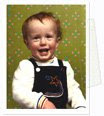
I'm thrilled to announce the safe arrival of our beautiful baby boy, Jack. He arrived on Winter Solstice 21st December - a bit early but fit, healthy and strong. Both he and his amazing mother are an inspiration to me.
Wednesday, 8 December 2010
New Work: Spectator Watch Supplement
\
Two portrait based illustrations for a recent feature in the Spectator. Apparently Peter Mandelson sports a ludicrously priced Patek Philippe, while Obama favours a more down to earth big watch issued by the CIA.
Monday, 25 October 2010
New Work: Financial Times
I worked on this illustration last week for Saturday's Financial Times, for an editorial piece about the shifting balance of economic power and democracy, and the idea of "Sum zero". Art direction was provided by Kevin Wilson.
Monday, 27 September 2010
Influences: William Eggleston

Woman on Swing, Late 1960s
The first photographer that I'd like to talk about is William Eggleston. Born and raised in Tenessee, Eggleston developed as an artist outside of the mainstream, resulting in a vision that is utterly unique. In the 1960s, when Eggleston began taking photographs, black and white photography was the accepted standard for fine art, while colour printing remained as a solely commercial process. When Eggleston's first major exhibition, "Color Photographs" debuted in New York's MOMA gallery in 1976, it ushered colour photography into a new era, one in which it was accepted as a legitimate medium in which to make fine art prints. Eggleston's work gloried in the richness and sensuality that the colour process afforded, and showcased an America that up until that point had not been noticed, at least not in 'high' culture.
Monday, 6 September 2010
New Work: Dustin Hoffman
New Work: Thank You

A couple of weeks ago I worked on this artwork for Presbyterian Record. I really enjoyed this one, as it gave me a chance to be really decorative and whimsical with different colours and patterns, and I think I've ended up with a good piece for the portfolio that looks a bit different from the stuff I normally do.
Thursday, 12 August 2010
New Work: Arcade Fire + Album Review
On Arcade Fire’s second album, 2007’s Neon Bible, the band got serious, with heavy, ponderous songs about the environment, the media and religion. It’s therefore something of a relief when the opening bars of the first and title track on this new album. The Suburbs, reveal a lighter touch, with a country shuffle that’s only slightly uneasy. The song’s winsome beat announces a new restraint that permeates much of the album. The band, which rose from the ranks of the achingly hip to stadium heroes in two albums flat, is not known for restraint. Rather, big, blood’n’thunder numbers belted out like lives depend on it by a veritable village is the traditional stock in trade. Think Ian Paisley and the E Street Band and you’re somewhere close..
Thursday, 5 August 2010
Thursday, 22 July 2010
Portraits For Bloomberg Businessweek, and a response.

Nouriel Roubini
A few weeks ago, I received a very nice commission from Bloomberg Businessweek to provide six portraits for a piece they were running about renewed pessimism amongst America's most eminent financial forecasters. Thanks to Richard Turley for the art direction.
A week or so later I received a post on this blog about the illustrations, from someone who seemed upset by them. He seemed particularly annoyed by the one of Meredith Whitney (shown below). I thought it was interesting enough to post up again here. After the illustrations you can read the post, followed by my response.
Wednesday, 21 July 2010
Follow me on Twitter

I've finally got round to setting up a twitter account, and now spend days at a time thinking of things to tweet that are clever, insightful, humble, cool, sweet and edgy all at the same time. Then I just decide to tweet something stupid. I badly need followers, so please join the congregation!
www.twitter.com/Barry_Falls
Monday, 19 July 2010
New Work: Cath

This is a drawing that I made a couple of months ago. It's a very special image for me because it features my lovely wife Cath, and also because it was drawn on the day that we found out that we were expecting our first child. That's right, we're having a baby!
We went out for a meal that night, and as I looked across the table at Cath there was something so vulnerable in her expression that I just thought to myself 'I have to record this in some way'. I snapped a picture of her on my phone, and made the drawing when I got home. I know it may seem odd that for such a happy time with such exciting news, the image is so subdued, somber even, but for me it captures something very special about that night. There was lots of smiles and happiness later of course, but I think we were both struck in that moment that night by the sudden feeling of responsibility. I don't often make such autobiographical pictures, but I was pleased that in this case I made the effort.
Thursday, 8 July 2010
Influences: Chris Ware

It's been about six years now since I discover the meticulous and neurotic work of the Chicago-based graphic artist Chris Ware. My first exposure to his ouevre came during my final year at University with my reading of the tri-generational family biopic graphic novel "Jimmy Corrigan: The Smartest Kid on Earth". At first glance it looked like a beautifully rendered piece of retro-Americana. On closer inspection however, it revealed itself to be an infinitely more complex and nuanced construction. Partly autobiographical in it's narrative, it was at times post-modern, at times sentimental, at times whimsical and at times profound. With as many layers as the most oniony of onions, it's a piece of art that will stand the test of time as a stunning testament to the power and potential of sequential art - or 'comics' to you and me. In certain parts it's very funny, but more often than that it's tragic, compelling and dark, and paints a picture of a world where loneliness and disillusion are as ubiquitous as fast food restaurants.
Subscribe to:
Posts (Atom)