Wednesday, 8 December 2010
New Work: Spectator Watch Supplement
\
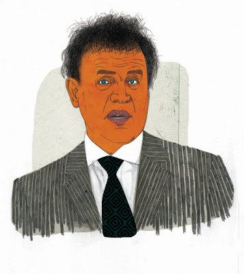
Two portrait based illustrations for a recent feature in the Spectator. Apparently Peter Mandelson sports a ludicrously priced Patek Philippe, while Obama favours a more down to earth big watch issued by the CIA.
Monday, 25 October 2010
New Work: Financial Times
I worked on this illustration last week for Saturday's Financial Times, for an editorial piece about the shifting balance of economic power and democracy, and the idea of "Sum zero". Art direction was provided by Kevin Wilson.
Monday, 27 September 2010
Influences: William Eggleston

Woman on Swing, Late 1960s
The first photographer that I'd like to talk about is William Eggleston. Born and raised in Tenessee, Eggleston developed as an artist outside of the mainstream, resulting in a vision that is utterly unique. In the 1960s, when Eggleston began taking photographs, black and white photography was the accepted standard for fine art, while colour printing remained as a solely commercial process. When Eggleston's first major exhibition, "Color Photographs" debuted in New York's MOMA gallery in 1976, it ushered colour photography into a new era, one in which it was accepted as a legitimate medium in which to make fine art prints. Eggleston's work gloried in the richness and sensuality that the colour process afforded, and showcased an America that up until that point had not been noticed, at least not in 'high' culture.
Monday, 6 September 2010
New Work: Dustin Hoffman
New Work: Thank You

A couple of weeks ago I worked on this artwork for Presbyterian Record. I really enjoyed this one, as it gave me a chance to be really decorative and whimsical with different colours and patterns, and I think I've ended up with a good piece for the portfolio that looks a bit different from the stuff I normally do.
Thursday, 12 August 2010
New Work: Arcade Fire + Album Review

On Arcade Fire’s second album, 2007’s Neon Bible, the band got serious, with heavy, ponderous songs about the environment, the media and religion. It’s therefore something of a relief when the opening bars of the first and title track on this new album. The Suburbs, reveal a lighter touch, with a country shuffle that’s only slightly uneasy. The song’s winsome beat announces a new restraint that permeates much of the album. The band, which rose from the ranks of the achingly hip to stadium heroes in two albums flat, is not known for restraint. Rather, big, blood’n’thunder numbers belted out like lives depend on it by a veritable village is the traditional stock in trade. Think Ian Paisley and the E Street Band and you’re somewhere close..
Thursday, 5 August 2010
Thursday, 22 July 2010
Portraits For Bloomberg Businessweek, and a response.

Nouriel Roubini
A few weeks ago, I received a very nice commission from Bloomberg Businessweek to provide six portraits for a piece they were running about renewed pessimism amongst America's most eminent financial forecasters. Thanks to Richard Turley for the art direction.
A week or so later I received a post on this blog about the illustrations, from someone who seemed upset by them. He seemed particularly annoyed by the one of Meredith Whitney (shown below). I thought it was interesting enough to post up again here. After the illustrations you can read the post, followed by my response.
Wednesday, 21 July 2010
Follow me on Twitter

I've finally got round to setting up a twitter account, and now spend days at a time thinking of things to tweet that are clever, insightful, humble, cool, sweet and edgy all at the same time. Then I just decide to tweet something stupid. I badly need followers, so please join the congregation!
www.twitter.com/Barry_Falls
Monday, 19 July 2010
New Work: Cath

This is a drawing that I made a couple of months ago. It's a very special image for me because it features my lovely wife Cath, and also because it was drawn on the day that we found out that we were expecting our first child. That's right, we're having a baby!
We went out for a meal that night, and as I looked across the table at Cath there was something so vulnerable in her expression that I just thought to myself 'I have to record this in some way'. I snapped a picture of her on my phone, and made the drawing when I got home. I know it may seem odd that for such a happy time with such exciting news, the image is so subdued, somber even, but for me it captures something very special about that night. There was lots of smiles and happiness later of course, but I think we were both struck in that moment that night by the sudden feeling of responsibility. I don't often make such autobiographical pictures, but I was pleased that in this case I made the effort.
Thursday, 8 July 2010
Influences: Chris Ware

It's been about six years now since I discover the meticulous and neurotic work of the Chicago-based graphic artist Chris Ware. My first exposure to his ouevre came during my final year at University with my reading of the tri-generational family biopic graphic novel "Jimmy Corrigan: The Smartest Kid on Earth". At first glance it looked like a beautifully rendered piece of retro-Americana. On closer inspection however, it revealed itself to be an infinitely more complex and nuanced construction. Partly autobiographical in it's narrative, it was at times post-modern, at times sentimental, at times whimsical and at times profound. With as many layers as the most oniony of onions, it's a piece of art that will stand the test of time as a stunning testament to the power and potential of sequential art - or 'comics' to you and me. In certain parts it's very funny, but more often than that it's tragic, compelling and dark, and paints a picture of a world where loneliness and disillusion are as ubiquitous as fast food restaurants.
Friday, 2 July 2010
New Work: Kublai Khan

I've just finished this piece of personal work, inspired in no small part by an episode of Radio 4's excellent series "A History of the World in 100 Objects", in which they talked about Chinese porcelain, and how it's development as a major Chinese export can be traced right back to the reign of Kublai Khan in the 13th century. I've always really loved the simplicity and boldness of these classic blue-and-white designs, especially when combined with a nice representation of a classic dragon or two.
Pecha Kucha

For the unenlightened, Pecha Kucha is a sort of social event for creative types, where an array of speakers deliver short, informal presentations on an established theme. Each speaker selects 20 images, which are then projected on-screen for 20 seconds each, a neat trick which ensures that the night bubbles along at a nice pace. Belfast recently played host to it's first Pecha Kucha event, and whaddya know, I was one of the speakers. The theme of the night was obsessions, and I based my presentation around self-obsession as a creative force. My choice of images went from Prince's LoveSexy album art through to Tracey Emin's dirty old bed.
If you were at the event, you'll know it was good fun, with a wide variety of speakers delivering a wide variety of ideas. If you weren't at the event, keep an eye out for future Pecha Kucha events in your area - they're all over the place! For more info, see here: http://www.pecha-kucha.org/
Monday, 28 June 2010
New Work: Financial Times


A nice job in from the Financial Times to accompany the announcement of George Osborne's so called 'Kill or Cure' Budget. The idea was to portray two characters that would be given food for thought by the new Tory measures - one a Flash Harry city type, the other a diligent middle-aged, middle Britain, pension holder. The pink newsprint sucked the colour out of them a little bit, so here they are in all their digital clarity. Thanks to Kevin Wilson for his supportive and constructive art direction.
Appeared in the FT on Wednesday 23rd June.
Monday, 14 June 2010
Influences: Max Beckmann

Self Portrait, 1922, Woodcut
For my next choice I've chosen the artist that has been the single, biggest influence on my choice of career and on the development of my style as an illustrator: the German painter Max Beckmann. It may not be immediately obvious when you compare his work to mine - the subject matter of my work being a lot lighter, generally speaking, and executed with a different hand and in a completely different medium - but I maintain that his work has been a constant inspiration to me ever since I first laid eyes on it back in high school.
Friday, 11 June 2010
Some questions answered...
Recently, an illustration student got in touch with me to ask me some questions about my work and how I feel about the increasing use of digital techniques within illustration. I thought it'd be good to post up my answers here. Thanks to Steven Marsden for the insightful questions.
New Work
Another piece of personal work, completed in between commissioned pieces (more on that later). The sheet music on the piano is the Beatles' "Love Me Do", and so the circle is complete. My idea for this piece was to let the style run wild and hopefully turn a simple composition into something quite esoteric and personal. A bit indulgent perhaps, but sometimes that can lead to the most memorable and meaningful images.
Thursday, 3 June 2010
Influences: Eric Gill

Self Portrait (Final State). 1927. Wood engraving
I've decided to add a bit more variety to the content here on my blog. As part of this, I'm going to occasionally post about artists, illustrators and designers who have significantly influenced my work. Initially, I had intended to put together a list of five or so key figures, but when I started thinking about it I realised that the idea would be better covered by an ongoing series of posts. Firstly, because that will give me the chance to cover each of the artists in a bit more depth, and secondly because there are just so many artists and designers that I admire that it seems a shame to limit the list to such a narrow selection.
Friday, 16 April 2010
New work
Thursday, 11 February 2010
Beatles

Just finished this portrait piece of the fab four - I posted the Paul drawing as a separate piece a couple of months back. For some reason I've been on a bit of a 60s British Invasion trip recently, with drawings of the Beatles, The Stones and The Who. There's something about the visual culture of the 60s that remains really compelling.
Wednesday, 6 January 2010
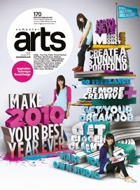
Computer Arts Profile
Subscribe to:
Comments (Atom)


